Capital Digestive Care
About
Capital Digestive Care is an organization made up of over 60 doctors specializing in digestive health in the DC metro area. They were established when 7 divisions merged into a single entity. Since then, Capital Digestive Care has been working to create a uniform experience for patients of all 60+ doctors across 16 office locations in Maryland, DC, and Virginia.
The problem
Patients were not used to thinking of Capital Digestive Care as their go-to choice for digestive health. There were unfamiliar with the recent merging of offices and not sure how to proceed. The goal of this redesign was to establish Capital Digestive Care as a leader in the region and allow users to quickly and easily find a doctor, make an appointment, and get directions.
Due to the recent merger we needed consider a variety of stakeholders:
The corporate office and their overall business goals
Individual offices with their own established systems and cultures
Doctors and how they want to be presented on the website
Business Goals
Improve the usability of the site for patients looking to make an appointment.
Increase ability for users to find the office location they’re looking for on the website.
Drive users to schedule an appointment for colon cancer screening.
My role
As the Lead UX Designer on this project I worked directly with the client to ensure that all stakeholder needs were identified and considered. I designed and created all wireframes (from hand sketches to high fidelity prototypes in Axure) and worked closely with the visual designer and developers to ensure that new pages and features were technically possible within the budget and timeline.
Main tasks
Communicate directly with business stakeholders to determine the business needs
Gather customer pain points
Redesign key experiences within the website
Design final user interface & experience for monitoring work flow
Visual Designer: Liz Merchant
Success metrics
Reduce patient calls to local offices asking for directions or to make an appointment
Increase number of new patients for all regional offices
Process
Persona
We had two primary personas: new patients, existing patients. New patients needed to be able to find a new doctor and make an appointment easily. Existing patients need to quickly find directions and be able to call the office to change an appointment.
Both personas were also looking for general information on digestive health.
Success criteria
We knew our design needed to do these 3 key things:
Establish Capital Digestive Care as a leader in digestive health in the region
Allow patients to quickly and easily find directions and contact information for any given location
Brainstorming
For new patients we knew that finding a doctor at a location that was convenient was their main goal. Existing patients need to find the location of their doctor’s office, typically in a hurry on their way to the appointment. They might search first by doctor, and then need to get quick directions. Or they might search by location and get to their doctor’s office that way. To support these scenarios, we created connections between the locations landing page, location detail page, and the doctor detail page.
Wireframes
Find a location
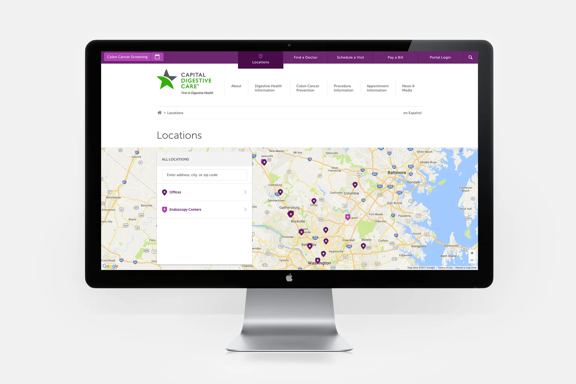
Focusing the user experience on a map did a few key things: 1) showed off the scope of Capital Digestive care at a glance; 2) allowed users to visually see which offices were convenient for them; 3) leverage existing interaction patterns for searching on a map.
Learn more about a doctor
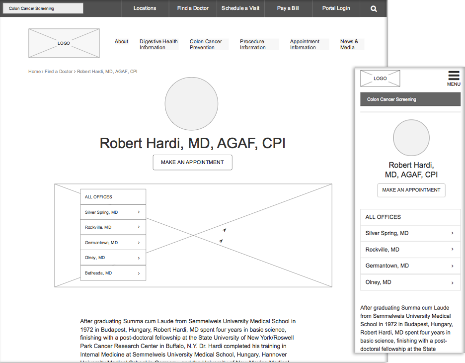
We knew from customer feedback that seeing what a doctor looks like, what their credentials are, and what offices they work in is top of mind for new patients.
Mockups
Find a location
Patients can glance at the map to see what location is most convenient for them, or they can scroll through the list of locations below the map and easily call or get directions.
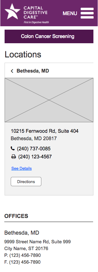
See a quick view of an office on the map view
View office details, including hours and doctor’s
Patients want a personal connection with their doctor, so we included photos to personalize the doctors and help set prospective patients at ease.
Learn more about a doctor
We knew that patients using mobile devices are looking to quickly find a doctor and make an appointment. We placed the “Schedule a visit” button prominently at the top of the screen and ensured the two call out buttons are visible by default on a standard mobile phone.
Launch
Due to a tight budget, we addressed improvements incrementally. We came up with a clear roadmap for what experience improvements would would tackle first. To address immediate customer pain points we prioritized the location and doctor finder experiences. The team continued to work on subsequent design improvements.
Post-launch
Stakeholders were very pleased with the outcome - no small feat! Unfortunately, we didn’t have direct access to customers so were not able to determine if our designs met the agreed upon measurements for success. The only way we could track success was through reduced calls to doctors’ office and they did not have the infrastructure in place to gather that data (sigh).
What I learned
Figure out a way to measure success
Often projects move so quickly, and you’re so busy engaging with business stakeholders and doing the design work, that you can forget to pause and figure out how you’re going to measure your success within the existing constraints. Identifying success metrics that you cannot measure due to limitations will not get you anywhere.
Engage with stakeholders often
With so many competing priorities it was critical that we engaged with all the stakeholders early and often. When there were conflicts, we maintained full transparency and engaged them as a partner in the design process.


